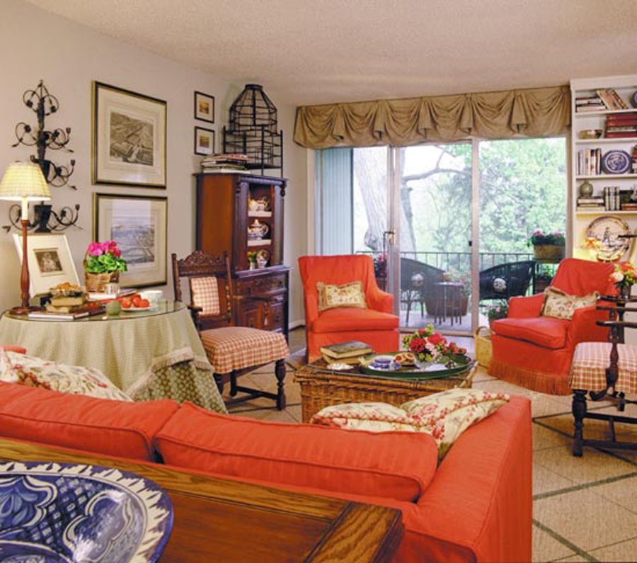
Even if you have followed the prior guidelines in previous posts, you may still feel that something is wrong with your room but you can't pinpoint what it is. There is a very simple reason why your efforts may not have worked: the arrangement of your furniture, art, and accessories may be creating the dreaded-and very common- "roller coaster" effect.
Is There a Roller Coaster in Your Home?
The fastest way to discover if you have a roller coaster is to take a "ride" around your room-with your eyes. By learning how to really "see" a room, you can quickly determine what the problem is and solve it. Unfortunately, we often can't see what's right under our noses until it's pointed out to us. So now is the time to share one of my tricks of the trade with you. It's a simple technique that only requires keen observation, like learning to read an X ray. Once you know what to look for, you can isolate the problem and determine a solution.
Isolating the Walls
Stand in the center of the room and face one wall.
Working from left to right (or right to left, if you prefer) take a longslow overview of the entire wall. As your eyes scan the first wall, look at each element on or against the wall (with particular attention to the tops of pieces) and ask yourself these questions:
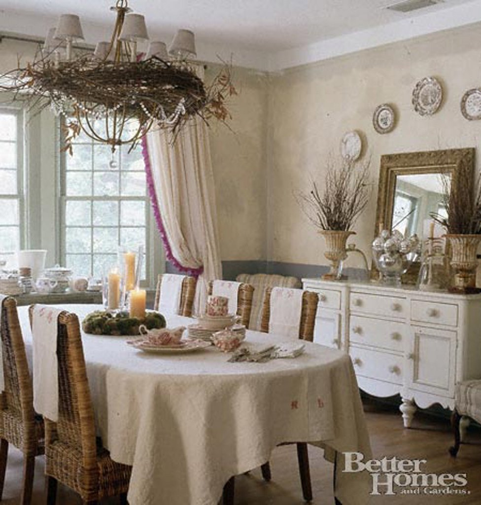
• Are my eyes being drawn up and down by the furniture, the art, the doors, and the windows because they are all different heights?
• Is there only one high vertical piece of furniture on the wall? If there is more than one, are they different heights?
• Is there a piece of art on the wall? How high or low is it hung in relation to other furniture, doors, windows, etc. If there is more than one piece of art, are these hung at different levels?
• Are accessories-flower arrangements, plants, or other decorative pieces-of unequal height?
• How do the doorways and windows fit into the overall arrangement? Do their heights differ?
Follow the same procedure on the three remaining walls. Make sure you take in every element on or against each wall. Draw an imaginary line linking the tops of every piece around the room. (Do you see the roller coaster, or is the line softly undulating or relatively even?) At this point, you should note the placement of the highest pieces of furniture in the entire room. Do they balance each other? If you have only one very tall piece of furniture, does it stand all by itself or is it adjacent to a very low piece?
Are the main furnishings-sofa, loveseat, and chairs-of similar heights or do they differ more than 5"? Are the low pieces in the room about the same height or do they differ dramatically?
Is there a hanging light fixture that is either too large or too small or hung at a level that creates another "bump" in your line of vision?
Color Theory
Analyze your home's colors for a decorating solution that creates a mood and complements your personality.
Designer Color Lesson
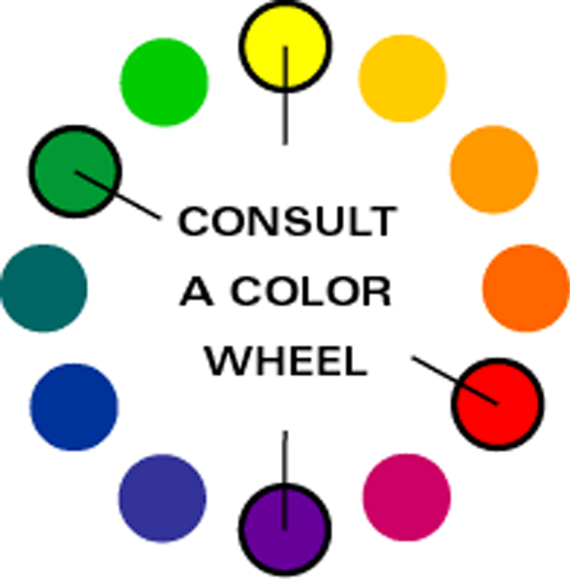
The color wheel offers the easiest way to visualize how hues relate to each other. Traditionally, artists have defined red, yellow, and blue as the three primary colors from which all others on the wheel can be mixed. Although this is technically true, an artist can't actually derive a pure green or purple from the primaries -- the intensity of the mixed color won't equal that of the parents. For decorating decisions, however, you need only be aware that purple relates to both red and blue and that green derives from yellow and blue. Those relationships mean the colors will harmonize with each other. Reading the Wheel: The color wheel generally shows the pure hues of colors: red, blue, and green. In decorating, however, you're more likely to be using tints (lighter values) and tones (also known as shades) that are darker values of a color. For example, you may not use an intense green in a room; you're more likely to go with a soft sage or a deep hunter green instead.Colors that lie opposite each other on the wheel are complementary; when paired, each makes the other appear more vivid. Hues that lie beside each other are analogous; they always look good together because they share a common hue. Triads are any three equally spaced colors on the wheel. These yield a lively yetbalanced combination, but the scheme may feel a little jarring unless you let one color dominate and use the other two in lesser amounts or as accents.
Warm and Cool: Stir Emotions
The color wheel also helps you identify warm and cool hues. Half of the color wheel, from red to yellow-green, is considered warm,stimulating, and advancing. Such a description reflects emotional associations (the sun looks yellow, and fire is orange and red, for example), but it has a basis in physiology: The eye can't bring the red and purple ends of the spectrum into focus at the same time, so it perceives red to be nearer or advancing. The other half of the wheel is described as cool; these colors generally appear to recede. Thus a small room may benefit from visually opening up the walls with a cool, or receding, paint color such as blue, green, or purple.
TIP: A warm color scheme needs a dollop of a cool hue to feel well-rounded and complete; think of a green plant in a yellow room.
TIP: A cool scheme needs a jolt of warmth to liven it up; thus a shot of red will perk up a room done in blue and white. Green and purple may seem to either advance or recede, depending on the context; for that reason, some interior designers consider them neutrals that can go with any color.
Value
You're probably attracted to colors not only for their specific hue -- red, blue-green, orange -- but also for particular values of those hues, such as pink, teal, or terra-cotta, for example. Value refers to the lightness or darkness of a color. A hue's value becomes lighter with the addition of white; black or umber (a blackish brown) darkens the value. Sky blue and robin's-egg blue are light values of blue, while navy and cobalt are dark values. Balance with Accents: Light and medium values live most comfortably with each other, but to keep a light-value scheme from becoming boring, include an accent of a darker value. In a room decorated in light blue and light yellow, for example, a touch of navy blue or cobalt blue will ground the scheme and give it depth.
Intensity
Another aspect of any color is its intensity or saturation. The pure hue represents the most intense or most saturated expression of a color. Adding the hue's complement will gray or muddy the color so that it's softer, more muted, and less intense. Lower-intensity colors generally create a calm, restrained mood that's subtle and serene. Higher-intensity (more saturated) colors generate more energy and can feel dynamic or richly elegant, depending on the specific colors and the style of your furnishings. Equal Partners: The key to successful color scheming is balance. Strong colors call for strong partners. This applies to both value and intensity. Navy blue walls, for example, demand an equally intense yellow or red to create a balanced scheme. Keep intensities equal or nearly equal. A saturated red calls for an intense green or yellow-green as a partner; a muted red-orange of lower intensity requires an equally muted yellow-green. Pairing colors of different intensities often creates a feeling of being out of balance.
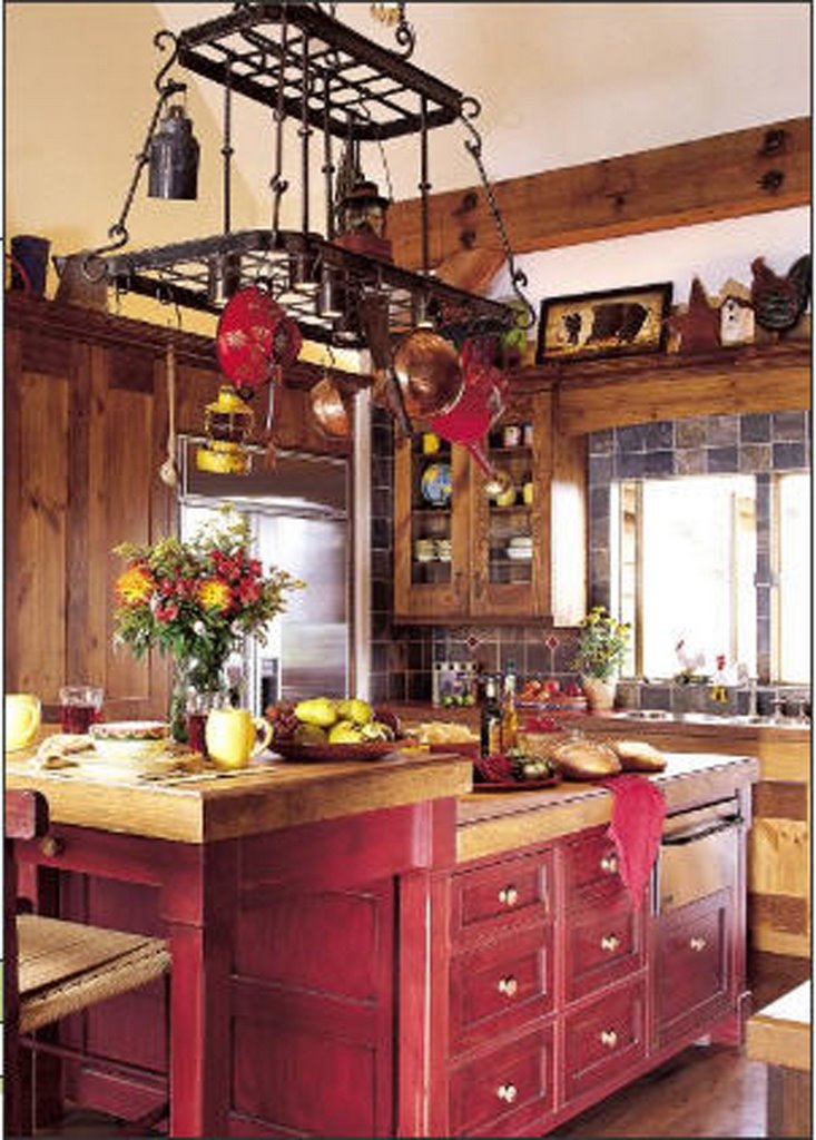
This kitchen is decorated in tints of warm reds, browns and golds creating a charming country cottage kitchen.
Lower-intensity colors create a subtle, calm mood airy and open in its feel.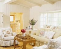

No comments:
Post a Comment