Tuesday, July 04, 2006


Cottage Styles........
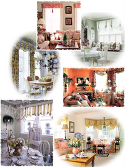
Let’s take a look at some cottage rooms from “Better Homes & Gardens” photo library........I’ve added some commentary!

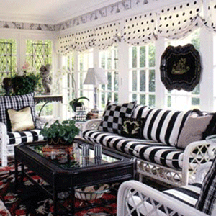
Black & white is a popular color combination. Paint some furniture black, and some white. Find coordinating fabric, at a reasonble price, and you have an elegant cottage porch look.


Campy 50's fabrics are still affordable. Look online for original or reproductions. Paint some furniture classic 50's cottage colors for some fun.


Paint a worn wood floor in diagonal squares. It visually expands a small room’s size. Build a simple cornice to hide curtain hardware and stencil it. Add some French and/or English vintage furniture finds, paiteg in pale shades, and you have viola!......a European shabby, but chic bedroom.

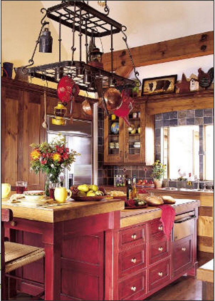
A combination of red & white on a backdrop of black & wood furniture creates a cozy French country cottage dining room. Using two or more coordinating fabrics on upholstered furniture is oh so cottage!

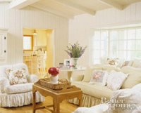
A bedroom awash in yellow-based cream and soft blue upholstery & wallpaper is sure to bring an air of serenity. Wallpaper is once again popular
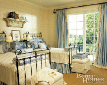
after a decade of disregard. Add architectural detail to a plain room by introducing a salvage piece and ornate iron beds and hardware. Throw a grass rug atop your wood or carpeted floors for added texture.

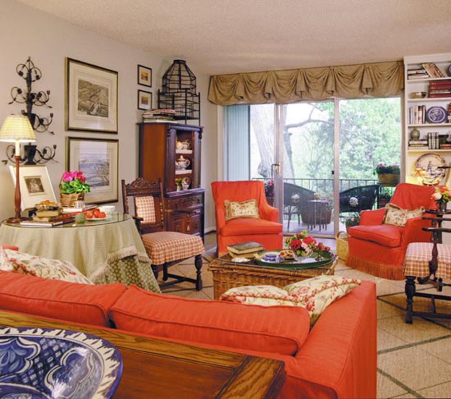
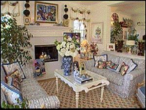
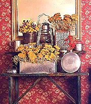
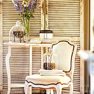
Mixing and matching different time periods and styles of furniture and accessories is what simple casual cottage is all about. The sideboard server in this picture are two diiferent pieces “married” together. The chairs are French reproductions from the 1950s. The candelabra is European. What brings these diverse elements together? The repetition of soft cream, yellow, and pinkbalanced throughout the room. Notice how accessories are grouped together for impact.

This is sheer elegant French Country cottage. The walls are washed with ochre & sienna for a warm glow. And, there is nothing more romantic than a four poster bed bedecked with beautiful fabrics. The coordinating toile, check and stripe fabrics pull together a cozy place for sweet dreams.

Why not paint grandmom’s old dining room set a cris
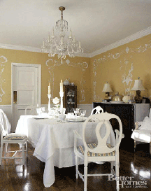
p white and add lovely old table linens for an updated vintage look. Paint the wall above a chair rail a soft color, then use a stencil with joint compound to create a raised architectural feature. The room will look as pretty as a wedding cake!

A chic, but shabby style room, updated with a color combination of cottage greens and pinks.


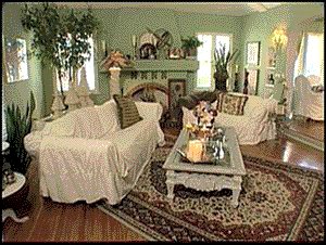
If you love traditional blues in a Victorian cottage room, this is the updated color combination for you. The crisp white painted beadboard and architectural feature above the fireplace awaken old, dark Victorian wood. The granny apple green walls are garden cheerful and brings a complmentary color to accentuate the blues.

Have you collected pictures of some favorite "Cottage Style" rooms for inspiration? Just send them to me at flourishings@hotmail.com and I'll post them here on my BLOG!

Monday, May 08, 2006

Furniture of Different Heights


Even if you have followed the prior guidelines in previous posts, you may still feel that something is wrong with your room but you can't pinpoint what it is. There is a very simple reason why your efforts may not have worked: the arrangement of your furniture, art, and accessories may be creating the dreaded-and very common- "roller coaster" effect.

Is There a Roller Coaster in Your Home?
The fastest way to discover if you have a roller coaster is to take a "ride" around your room-with your eyes. By learning how to really "see" a room, you can quickly determine what the problem is and solve it. Unfortunately, we often can't see what's right under our noses until it's pointed out to us. So now is the time to share one of my tricks of the trade with you. It's a simple technique that only requires keen observation, like learning to read an X ray. Once you know what to look for, you can isolate the problem and determine a solution.

Isolating the Walls
Stand in the center of the room and face one wall.
Working from left to right (or right to left, if you prefer) take a longslow overview of the entire wall. As your eyes scan the first wall, look at each element on or against the wall (with particular attention to the tops of pieces) and ask yourself these questions:
• Are my eyes being drawn up and down by the furniture, the art, the doors, and the windows because they are all different heights?
• Is there only one high vertical piece of furniture on the wall? If there is more than one, are they different heights?
• Is there a piece of art on the wall? How high or low is it hung in relation to other furniture, doors, windows, etc. If there is more than one piece of art, are these hung at different levels?
• Are accessories-flower arrangements, plants, or other decorative pieces-of unequal height?
• How do the doorways and windows fit into the overall arrangement? Do their heights differ?
Follow the same procedure on the three remaining walls. Make sure you take in every element on or against each wall. Draw an imaginary line linking the tops of every piece around the room. (Do you see the roller coaster, or is the line softly undulating or relatively even?) At this point, you should note the placement of the highest pieces of furniture in the entire room. Do they balance each other? If you have only one very tall piece of furniture, does it stand all by itself or is it adjacent to a very low piece?
Are the main furnishings-sofa, loveseat, and chairs-of similar heights or do they differ more than 5"? Are the low pieces in the room about the same height or do they differ dramatically?
Is there a hanging light fixture that is either too large or too small or hung at a level that creates another "bump" in your line of vision?

Color Theory
Analyze your home's colors for a decorating solution that creates a mood and complements your personality.

Designer Color Lesson
The color wheel offers the easiest way to visualize how hues relate to each other. Traditionally, artists have defined red, yellow, and blue as the three primary colors from which all others on the wheel can be mixed. Although this is technically true, an artist can't actually derive a pure green or purple from the primaries -- the intensity of the mixed color won't equal that of the parents. For decorating decisions, however, you need only be aware that purple relates to both red and blue and that green derives from yellow and blue. Those relationships mean the colors will harmonize with each other. Reading the Wheel: The color wheel generally shows the pure hues of colors: red, blue, and green. In decorating, however, you're more likely to be using tints (lighter values) and tones (also known as shades) that are darker values of a color. For example, you may not use an intense green in a room; you're more likely to go with a soft sage or a deep hunter green instead.Colors that lie opposite each other on the wheel are complementary; when paired, each makes the other appear more vivid. Hues that lie beside each other are analogous; they always look good together because they share a common hue. Triads are any three equally spaced colors on the wheel. These yield a lively yetbalanced combination, but the scheme may feel a little jarring unless you let one color dominate and use the other two in lesser amounts or as accents.

Warm and Cool: Stir Emotions
The color wheel also helps you identify warm and cool hues. Half of the color wheel, from red to yellow-green, is considered warm,stimulating, and advancing. Such a description reflects emotional associations (the sun looks yellow, and fire is orange and red, for example), but it has a basis in physiology: The eye can't bring the red and purple ends of the spectrum into focus at the same time, so it perceives red to be nearer or advancing. The other half of the wheel is described as cool; these colors generally appear to recede. Thus a small room may benefit from visually opening up the walls with a cool, or receding, paint color such as blue, green, or purple.
TIP: A warm color scheme needs a dollop of a cool hue to feel well-rounded and complete; think of a green plant in a yellow room.
TIP: A cool scheme needs a jolt of warmth to liven it up; thus a shot of red will perk up a room done in blue and white. Green and purple may seem to either advance or recede, depending on the context; for that reason, some interior designers consider them neutrals that can go with any color.

Value
You're probably attracted to colors not only for their specific hue -- red, blue-green, orange -- but also for particular values of those hues, such as pink, teal, or terra-cotta, for example. Value refers to the lightness or darkness of a color. A hue's value becomes lighter with the addition of white; black or umber (a blackish brown) darkens the value. Sky blue and robin's-egg blue are light values of blue, while navy and cobalt are dark values. Balance with Accents: Light and medium values live most comfortably with each other, but to keep a light-value scheme from becoming boring, include an accent of a darker value. In a room decorated in light blue and light yellow, for example, a touch of navy blue or cobalt blue will ground the scheme and give it depth.

Intensity
Another aspect of any color is its intensity or saturation. The pure hue represents the most intense or most saturated expression of a color. Adding the hue's complement will gray or muddy the color so that it's softer, more muted, and less intense. Lower-intensity colors generally create a calm, restrained mood that's subtle and serene. Higher-intensity (more saturated) colors generate more energy and can feel dynamic or richly elegant, depending on the specific colors and the style of your furnishings. Equal Partners: The key to successful color scheming is balance. Strong colors call for strong partners. This applies to both value and intensity. Navy blue walls, for example, demand an equally intense yellow or red to create a balanced scheme. Keep intensities equal or nearly equal. A saturated red calls for an intense green or yellow-green as a partner; a muted red-orange of lower intensity requires an equally muted yellow-green. Pairing colors of different intensities often creates a feeling of being out of balance.


This kitchen is decorated in tints of warm reds, browns and golds creating a charming country cottage kitchen.

Lower-intensity colors create a subtle, calm mood airy and open in its feel.

Intense, deep value colors make a bold statement in a room creating a stiking yet cozy room.

Tuesday, March 28, 2006

Proper Furniture Placement


Need Help Re-Designing a Room?

Visit Our “Design Online” pages for
affordable help.

www.cottageflourishings.com

• "There just isn't any other way to arrange my furniture."

• "If I rearrange things, they just won't look right."

• "I've tried moving the living room furniture around every possible way
I could think of, and it just never looks any better. It isn't ever comfortable, either."


Chances are you've said these same things to yourself. There's one basic reason why you might feel unhappy with the arrangement you have, so I suggest that you take another good look at your living room right now with the following question in mind: Is all the furniture pressed against the walls?
Who can't recall a living room with all the big furnishings pressed against the walls? Lined up, one after the other, were end tables, sofas, armchairs, rockers, a piano, floor lamps. And let's not forget the wall units, armoires, bookcases, and various cabinets that may have stood side by side with them.
Do you remember how you felt in that room? Did it give you the same feeling you have in a doctor's waiting room? Was it easy to have a conversation in that room? How accessible was the coffee table? And even if the room was large, despite the space in the middle of the room, did you feel that the furniture was crowding you in, making you feel claustrophobic? The inclination to turn furniture into "wallflowers" is, unfortunately, a tradition that has been passed down from generation to generation. Perhaps it made enormous sense when there was a fire in the middle of the living space.
Today, however, there is absolutely no good reason to do so.
Pushing furniture - especially seating - up against the walls is one of the common design mistakes that I encounter. Most people assume that this configuration will create the illusion of more space or allow them to put more furniture in their room. Others believe that it permits easier access into and out of the room.
Ultimately, the only result is a "wallflower" room that feels uncomfortable and looks awkward.
And, unless the room is very tiny, it also lacks a comfortable conversation area and probably creates the roller-coaster effect with furniture of varying heights lined up against the wall.

Your Furniture Placement Checklist

To make sure that you have eliminated the "line-up" in your room and enhanced both its function and comfort, consider the following:
• Is the sofa or loveseat against the longest wall? Or, if at a right angle to the wall, does it define
the living space or anchor a conversation area without creating obstacles to traffic flow?
If you own both a sofa and loveseat, is the sofa placed against the longest wall with the loveseat
at a right angle to it? Have you added one or two chairs on the opposite side to complete the grouping?
• If you own a sectional or modular unit, have you configured it to facilitate the flow of traffic
through the room?
• Are your occasional chairs positioned "off the walls" and facing each other or part of a U-shaped
arrangement with a sofa or loveseat?
• Have you removed any excess pieces, such as unneeded end tables?


Creating Fluid Traffic Patterns

In every room of your house you should be trying to create traffic patterns that let you you enter and walk around the room with the most ease. Proper furniture placement may at first seem a complicated task, but all it really takes is common sense and learning to look at your rooms in a new way.
Consider, for instance, your kitchen or dining table. Are the table and chairs accessible from three or, preferably, from four sides? They probably are. What is true for your dining room or kitchen, should also be true for your living room seating area. Every room should invite you in, not stop you at the doorway before you enter it. It's important to create a path that flows in and out of the room easily. To make sure that you have the best traffic pattern possible for your space, take note of these points:
The location of your doorways: If there are two doors, consider having the traffic pattern move behind the seating, not through it, from one door to another. If there is only a single doorway, it's best to have easy access directly to the seating, as long as you leave enough room around the sides and behind it to move comfortably.
The placement of your major piece of furniture: If your sofa is placed off the wall, leave a minimum of 2.5 to 3 feet of walking space behind it. A bit less space is needed in between chairs and the sofa.
The seating arrangement: If you have a long wall, establish your seating arrangement there, with the sofa against the wall as the anchor. Traffic will flow around it.
Obstructions: If a sofa or chair is obstructing a doorway, it must be moved.
Lethal weapons: Sharp edges on coffee tables or end tables force you to slow down or even swerve to avoid hitting them. Using round, oval, or rectangular pieces with rounded corners will contribute to a safer, more comfortable flow.


Saturday, February 25, 2006


The Four Goals of a Conversation Area
1. To create a simple arrangement of furniture so that people can sit facing each other and can speak without raising their voices. Generally, the basic ingredients required to create the ideal conversation arrangement is a standard living room are a sofa, a piece of furniture serving as a coffee table (it can be an ottoman, for instance), and two upholstered chairs. There are alternatives, however, such as a pair of loveseats with a pair of chairs. But keep two things in mind: a) upholstered furniture is the more comfortable, and b) whatever the configuration, everyone seated should be able to reach the central coffee table. If space allows, a secondary privacy area can be set up, which might consist of a desk and a chair, or a club chair and ottoman with a table and lamp next to it. Very large rooms can even hold back-to-back sofas or love seats, creating two separate and distinct conversation areas with the addition of chairs.
2. To establish a focal point in the room. A wall unit, fireplace (a real on if you're lucky, or a fake one, if you can manage it), or even a grand piano can serve as the dominant fixture in the room, which helps orient the whole arrangement and gives you a visual reference point.
3. To eliminate traffic that runs through the conversation area (unless there is no alternative). In other words, the arrangement should be self-contained so that conversations will not be interrupted.
4. To free up space in the room for other functions, like a separate reading or working area. Once you establish a workable arrangement, the rest of the room begins to fall into place naturally-like finding the key piece in a complex jigsaw puzzle.
••••••••••••••••••••••••


Focal Points in Other Rooms
In rooms other than the living room, the focal point is more often defined by the use of the room. The bed in the bedroom or a wall in a study are the most obvious examples. One important exception is in the dining room, where the table or its decoration cannot serve as the room's centerpiece.

The Dining Room
The same guidelines that help establish the focal point in the living room apply to the dining room. Therefore, your dining table, with its central location, is automatically eliminated as a focal point. And it's not just placement that is a factor; even if your table is against a wall, it still won't qualify because there's nothing visually important on the wall. Remember, the focal point must dominate one wall. What will work? A buffet with a large painting, a grouping, or a framed mirror above it can work; an extremely large oil painting; or a mural alone on one wall. And of course, a fireplace with art hung above, a wall of sliding or French doors, or a large picture window will always dominate a room- any room-visually. If you choose to make your sideboard the focal point you can use two dining chairs to flank it and make it more important. If you have a combined living room and dining room-whether it's a shape or long rectangle-each area needs its own focal point.

The Bedroom
In the bedroom, the bed is almost always the focal point simply because of its size.With the bed placed against the longest wall, you will want to follow the same guidelines that we discussed earlier for creating and enhancing a focal point. If you don't have a headboard, you can create an attractive backdrop with a decorative or metal screen or panel behind the bed. If you have a simple headboard, you may want to hang a wide painting or a trio of frame prints above the bed. An elaborate headboard will serve as a focal point with no additional enhancement necessary. Matching end tables with lamps will make the bed seem wider, giving it additional prominence as the focal point. Many bedrooms do not have a long wall uninterrupted by doors and windows. You might consider positioning your bed in front of a double or a large picture window. This will create a more dramatic focal point, especially if there is a good view. Also, you can accentuate the appeal of the bed itself by using linens and accessories to their best advantage. Even if you have a large armoire or a dresser with a grand mirror, the bed and its headboard remain the only focal point with few exceptions, such as a wall of glass doors or windows that reveal a great view.

The Foyer
It can be dramatic or simple, fussy or serene-the focal point of your foyer has two jobs. It must attract you and welcome you. An ornately carved mirror above a bombe chest commands attention with its elegance. A large oil painting of a sunny seascape paired with a weathered pine bench please your eyes with their warmth. The image of an eye-catching framed black-and-white photo leaning on an ebony shelf in a tiny vestibule is difficult to ignore And just as a travel brochure is meant to draw the traveler to more exciting destinations, an alluring focal point will make whoever walks through the door eager to see more.

Your Focal Point Checklist
To make sure that you have found or created an effective focal point, consider the following:

Have you identified the largest, most dramatic element in your room?

Does your conversation area face the focal point or is it part of it?

Have you reinforced the focal point by placing other furnishings and accessories around it to balance and emphasize it?

Is the painting, mirror, or screen over or behind the sofa both large and dramatic enough to provide the impact you want?

If you are using a medium-sized armoire, bookcase, or wall unit as a focal point, are you using art or accessories on either side of it to make it look broader and more striking?

Can you use a cherished keepsake or antique piece to create the focal point?

Have you created a focal point for your dining room other than the table?

If you have a combined living and dining room, have you balanced the focal points for each room so that they are distinctive yet do not overpower one another?

Do accessories and art reinforce your bed as the focal point of the bedroom?

Do you have a piece of art or a mirror above a shelf or chest in your entrance?

Are you comfortable?

Thursday, February 16, 2006

The Ten Most Common Decorating Mistakes
Here they are, the ten missteps that can jar your eye, generate irritation, and make you feel uncomfortable in your own home:
1. Not defining your priorities
2. An uncomfortable conversation area
3. Poor furniture placement
4. A room that is off-balance
5. Furniture of different heights
6. A room that lacks a cohesive look
7. Ignoring the room's focal point
8. Improper use of artwork
9. Ineffective use of accessories
10. Using lighting incorrectlyThis month we will be reviewingthe conversation area

Friday, December 09, 2005


Some Ideas for Displaying Accessories

Balancing Act

Balance in a composition creates a kind of calm that appeals to our sense of order. To tip the scale in favor of a harmonious display, think about each element's visual weight. Of same-sized items, those with bright or dark colors will dominate less intense items. Objects with more texture, bolder patterns, and unusual outlines also seem heavier to the eye. In this collection of dried flowers and tin, the large rectangular box on the bottom was placed first for emphasis and as a solid building block. A substantially sized canteen and flower-filled grater form its partners in the first eye-grabbing triangle. You could stop there. Or, mass for impact, filling in with smaller but more intricate items that complete the balancing act and lend interesting contrast to the large, smooth objects. Proportion is key to displaying collectibles.

Room for Display


Large tabletops offer room to display your treasures. The vintage metal table and chair, rust and all, look perfectly at home with a changing display of fruit, vegetables, and wildflowers casually displayed in pieces from a collection of white ceramics.

A variety of heights gives this arrangement a pleasing flow.

Simple Backgrounds

The simple background of this space is the key to the room's uncluttered look -- a perfect backdrop for interesting pieces including vintage elements. Plants and flowers are wonderful accessories in this space. The mantel offers another arena to show off treasured items.

Focus on Shape

Eliminating color allows the eye to focus on the shape and texture of an object, such as this curvy garden table and baluster lamp. A dried flower arrangement fills the space under the lampshade while smaller pieces bring the eye all the way down to the tabletop -- a useful technique for any side table display.

Layer the Details

These items standing alone would look forlorn, yet in a grouping they sing. Layering pieces from front to back and from high to low is a great technique to apply to displays in your own home, creating dimension and depth.

Create Vignettes

A pair of large louvered shutters creates the feel of a mini-room. Use this technique to create intimacy and charm, both in large arrangements of furniture as well as smaller displays of accessories. Highlight special pieces by isolating them. Here, sparkling glass cloches (bell jars) cover little bird nests with a bit of style and shine.

Have a Focus

Collections should have a focus -- a specialty, if you will. Romantic lines and a sense of history connect these unusual pieces, with a focus on things that are vintage, white, distressed, ornate, natural, and sculptural. What's your accessory or collecting focus?

Vary Size to Keep the Eye Moving

Make a tiny shelf a point of interest by filling it with objects large and small. The white teapot is related to the tiny doll teacup by both color and function. The mix of sizes adds interest while the different shapes add charm.

Keep Small Collections Together

An old window was the starting point for this arched display niche. A box was built behind the window and fit with little shelves to provide a home for smaller items that might be lost on a big tabletop.

Notice how various items are propped up, filled with flowers, or extended outside of the window for added interest.

Corral Items You Love


These beautiful handwritten postcards might be from your attic or an antique store, but they speak to the nostalgic yearnings in our hearts. Look for items that speak to your heart and arrange them together. Using things you love, you'll find arranging, and even cleaning, will be more fun.

(Sure!)